Inside Bricsys: Designing BricsCAD Shape
Ghent, Belgium

Inside Bricsys: Designing BricsCAD Shape
Guest Post by Lio Linger
BricsCAD Shape makes modeling fun. This is how we designed it.
Sander Scheiris, VP Marketing
Shape was built to make your schematic design workflow more intuitive, without sacrificing accuracy. ‘
We wanted that CAD accuracy to fit in a clean and simple user interface. BricsCAD Shape isn’t just a stripped-down version of full-on BricsCAD.
We have redesigned the user interface from scratch.
You could argue that Shape is a marketing tool. Of course, it brings the BricsCAD brand to a larger group of architects and engineers.
But believe me, we are really in love with this product. We’ve wanted to build this kind of interface for years.
Shape proves that 3D CAD can live behind a simple interface.
We’ve learned a lot during this design and development project.
Soon you will see these kind of user interface improvements in BricsCAD as well. I simply can’t wait to see what our users will build with Shape.

Ann Van Haeken, Graphic Designer
Stripping the Shape user experience down to its core was challenging.
We asked ourselves “What does the user really need when he or she is ‘Shaping’?”.
Eliminating complex settings and tool options was a big part of the process.
I believe that User Interfaces should be as invisible as possible and that is where we are heading with BricsCAD Shape. I am a big believer in quality over quantity.
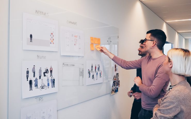
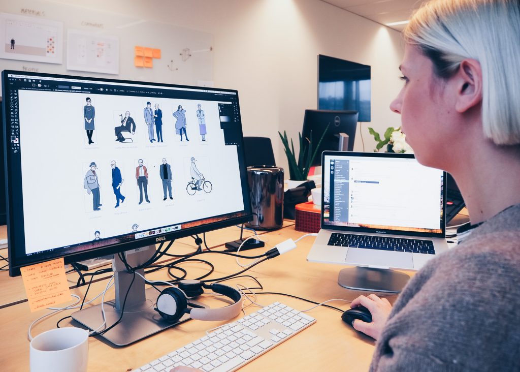
Adding the famous architect silhouettes to Shape was fun. I love character design.
We didn’t want to add generic figures. We think it’s more fun for the user, and it helps them relate to the product. It’s paying a small tribute to the “iconic” architects of today and the past.
As an in-house designer, I have the ability to see the product from concept to delivery.
You live with the design as the product evolves, to make sure that it works the way it should. It requires long term thinking.
Watching it grow and helping out where I’m needed is very rewarding. Shape is still evolving, and will get better as we grow.

Hannes Ledoux, Graphic Designer
Instead of using old-fashioned dialogs with tons of options, we chose to work with a multi-purpose sidebar.
The sidebar offers quick access to the tools and components you need most.
When you want to focus on modeling, you can simply collapse it to regain your screen real estate.
Our next big challenge will be to transfer this simple UI design philosophy to BricsCAD BIM.
Shape was a fun project to work on, because we had the chance to “start from scratch” and design what we always had in mind. I’m really proud of the intuitive interface of BricsCAD Shape.
Stop sketching. Start shaping.
Get your free copy of BricsCAD Shape. If you love it, tell your peers to download it, too.
We’re pretty proud of the clean and simple learning materials for the product – check out “30 minutes to Shape” on YouTube. All for free.

